Brand and app interface for a food-service SaaS (concept)
A brand and app concept for a tool that gives head chefs their time back.
Restimation
2025 · Concept project
Scope
- Brand strategy
- Branding
- Tone of voice
- Mobile UI
- Communication toolkit


Process
01
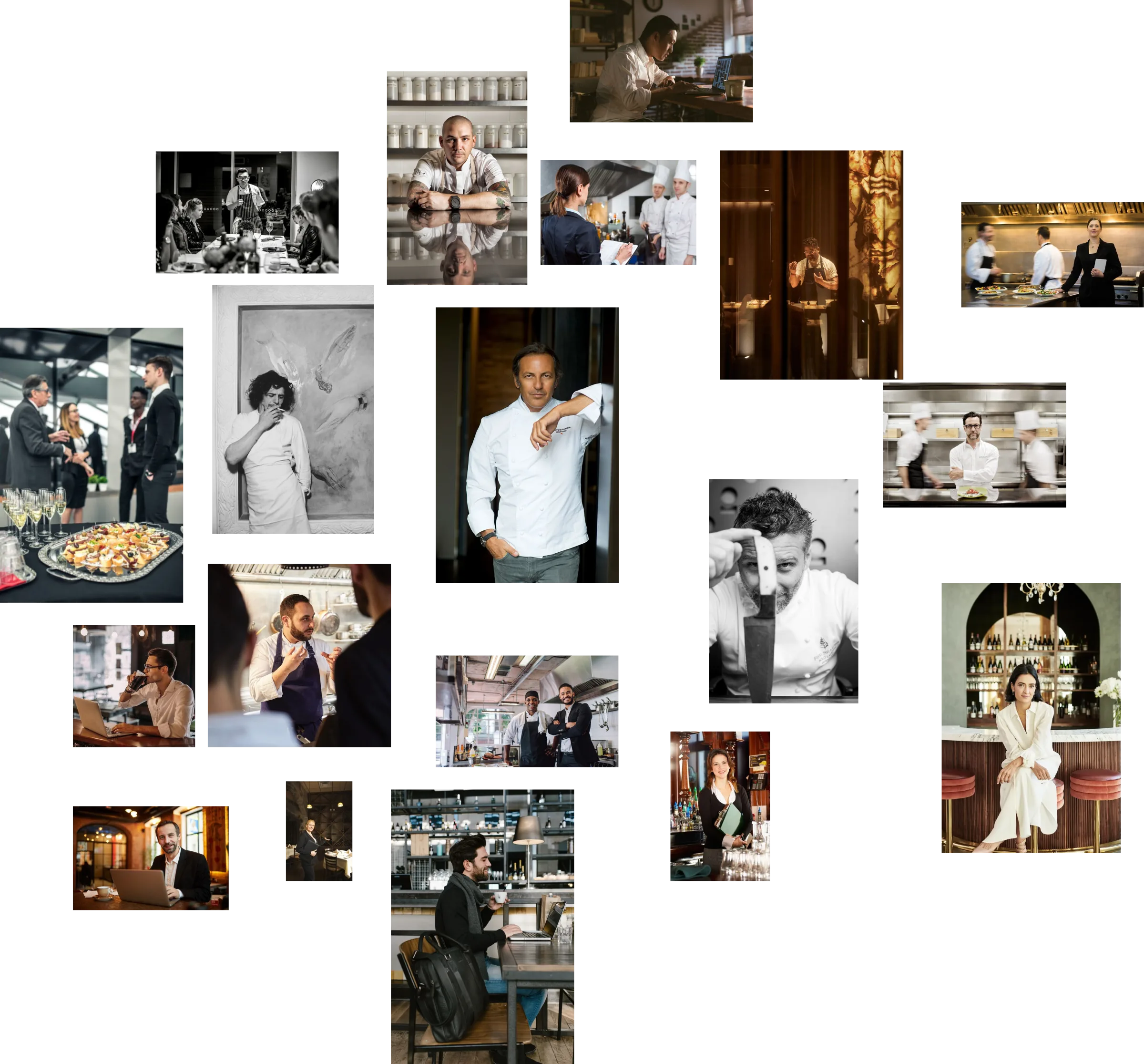
Moodboard · visual direction
Starting point — from chaos to harmony
Auto-play · use ← → or click a dot · pausable
The challenge
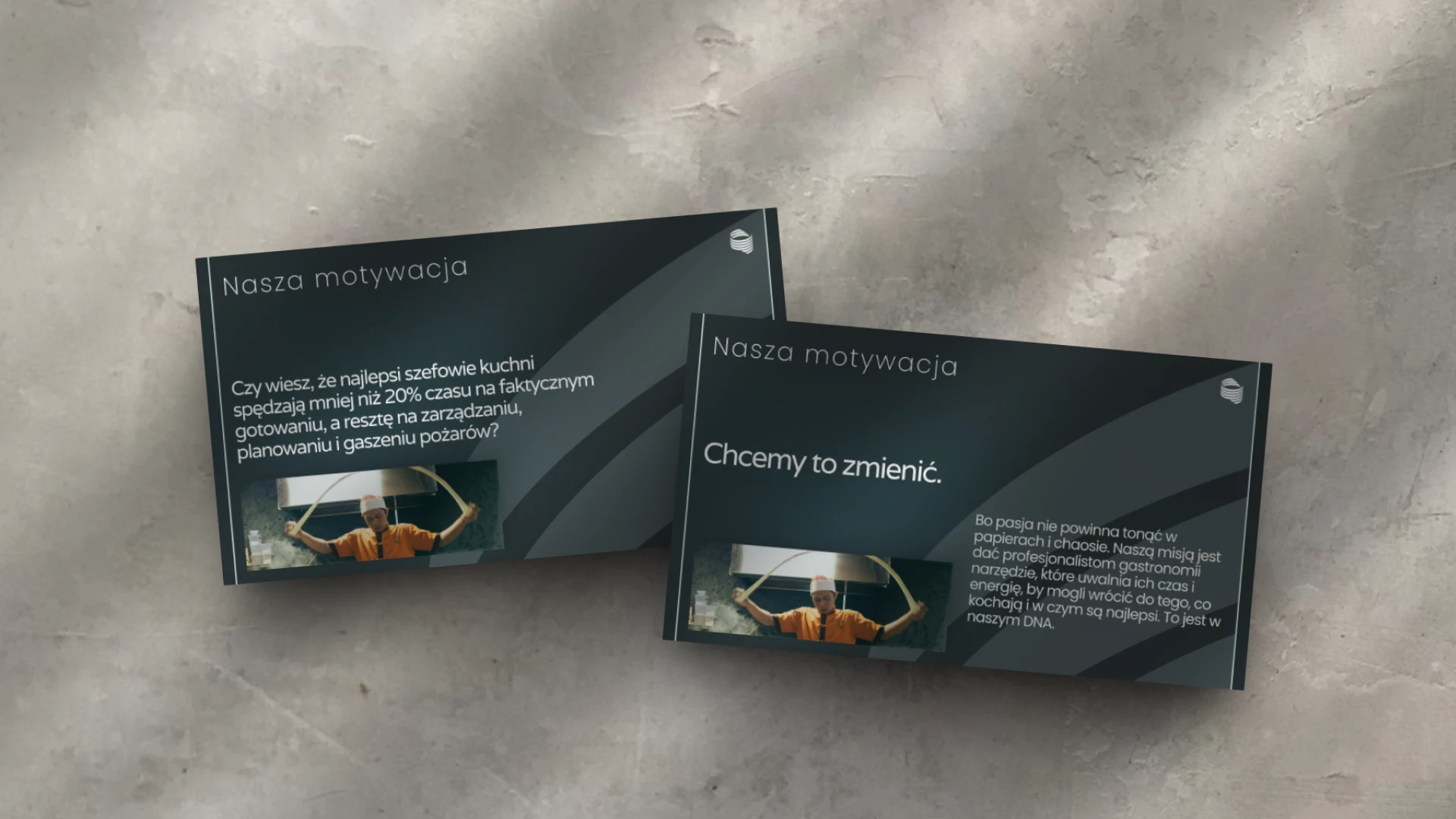
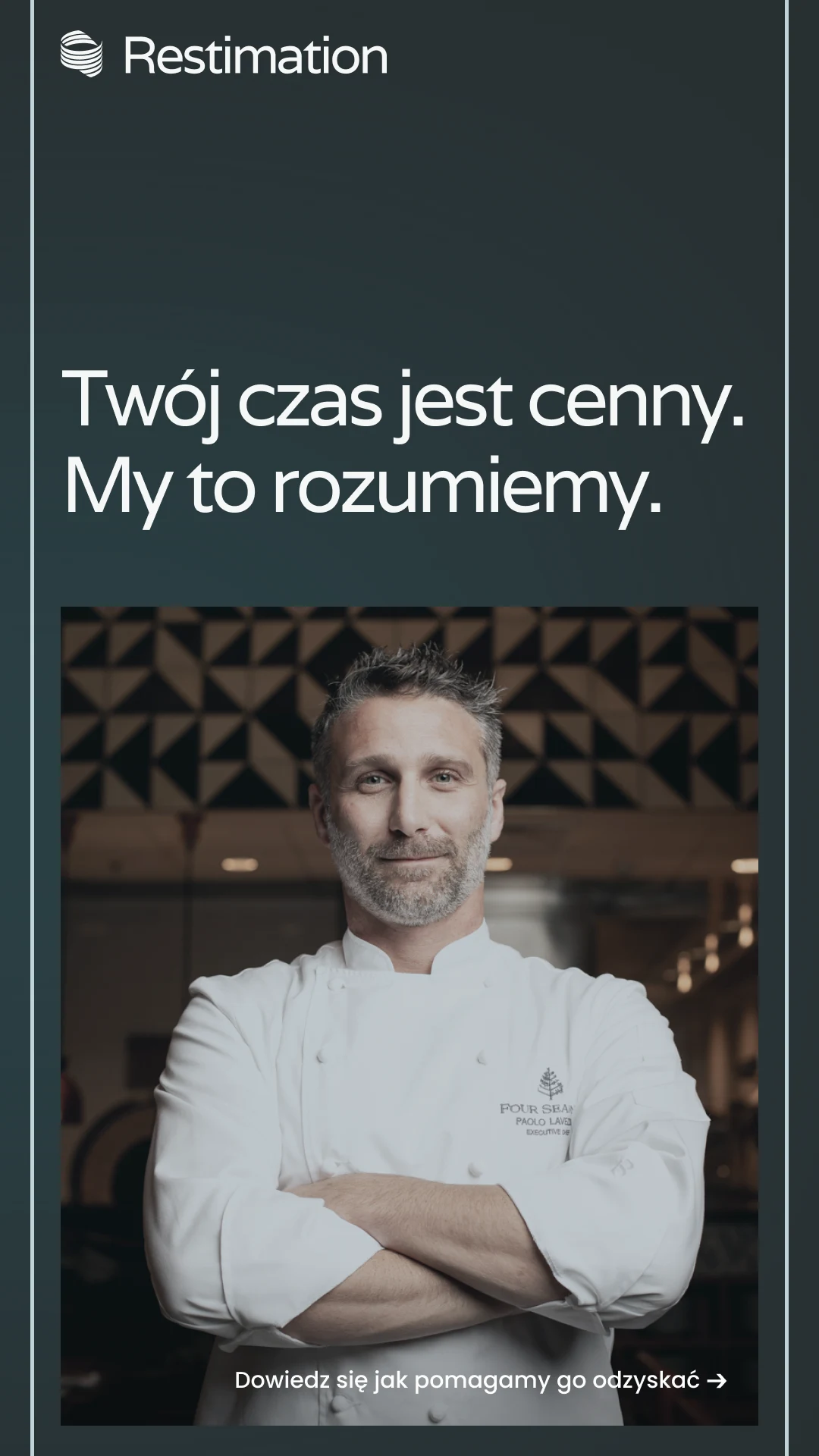
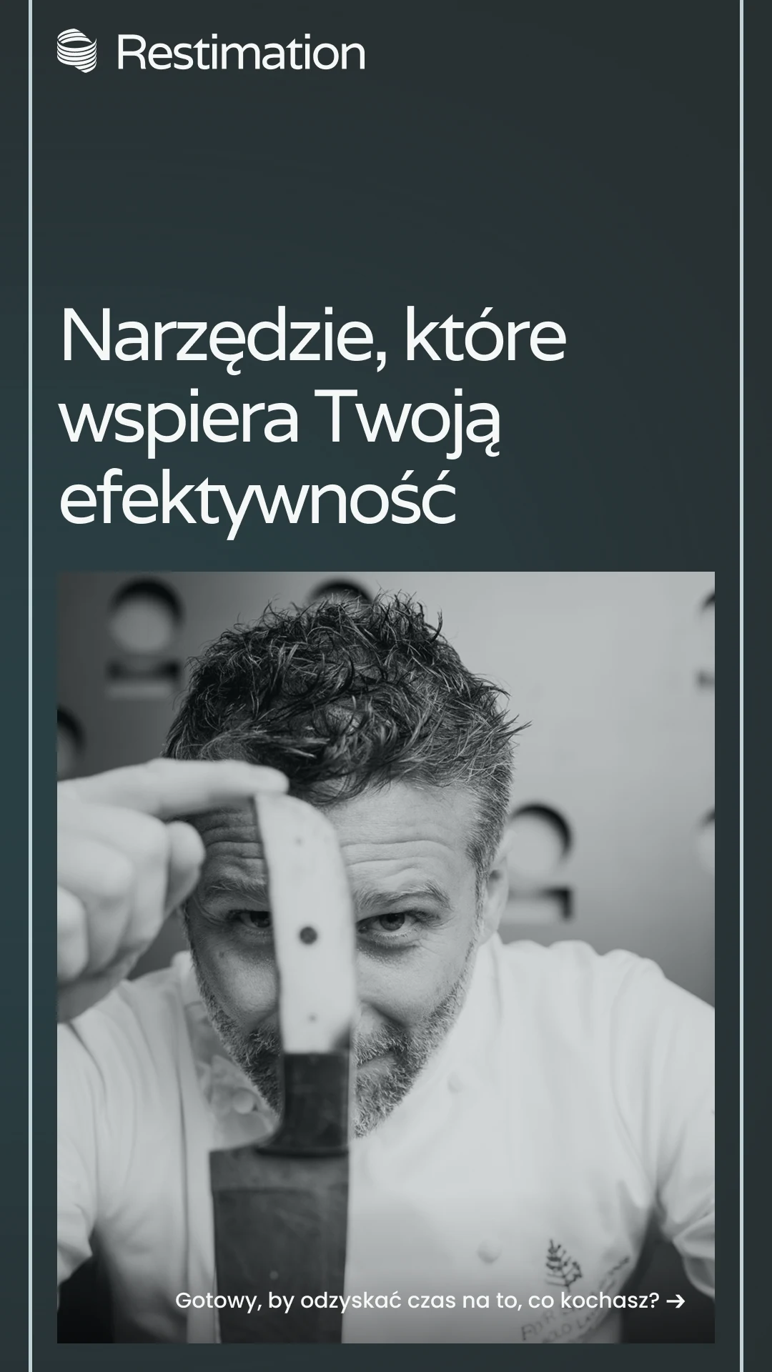
A head chef cooks for less than a fifth of their working time. Management and paperwork take the rest. Restaurant software speaks corporate. Restimation needed a brand that sounds like a partner, in the deck and in the app.
Goals
- Positioning as a partner for food-service professionals.
- One idea across all channels: calm and control.
- Warm, concrete language in the investor deck and in the app.
- A visual system ready for slides, social and the interface.
- App buttons speak the same language as the brand.
Brand animation
Scope of work
Brand strategy
- Positioning: a partner for food-service professionals, not another tool for startups.
- Leading thought: instead of management chaos — calm and control.
- Brand character: confident, mature, serious, rather classic than „disruptive”.
- Value in three layers: concrete help (AI, surveys, one place for communication), convenience (an intuitive interface) and the staff voice (a place for feedback).
Branding and identity
- Symbol: a ring with orbital lines — core, cycle, flow.
- Colors: navy as the base, yellow as the single accent (buttons, energy), light greys as the interface background.
- Typography: a geometric, economical Swiss-inspired typeface.
- Logo in two versions (dark and light), ready for any background.
Communication and materials
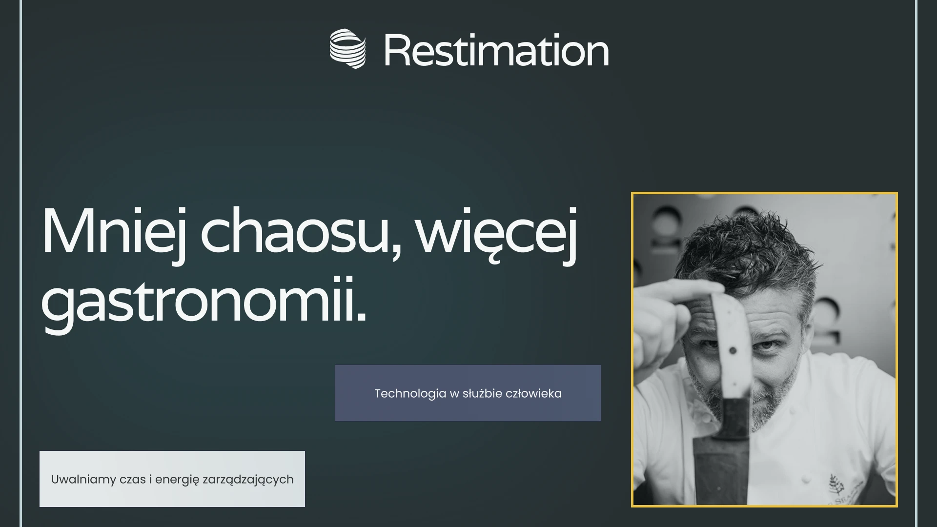
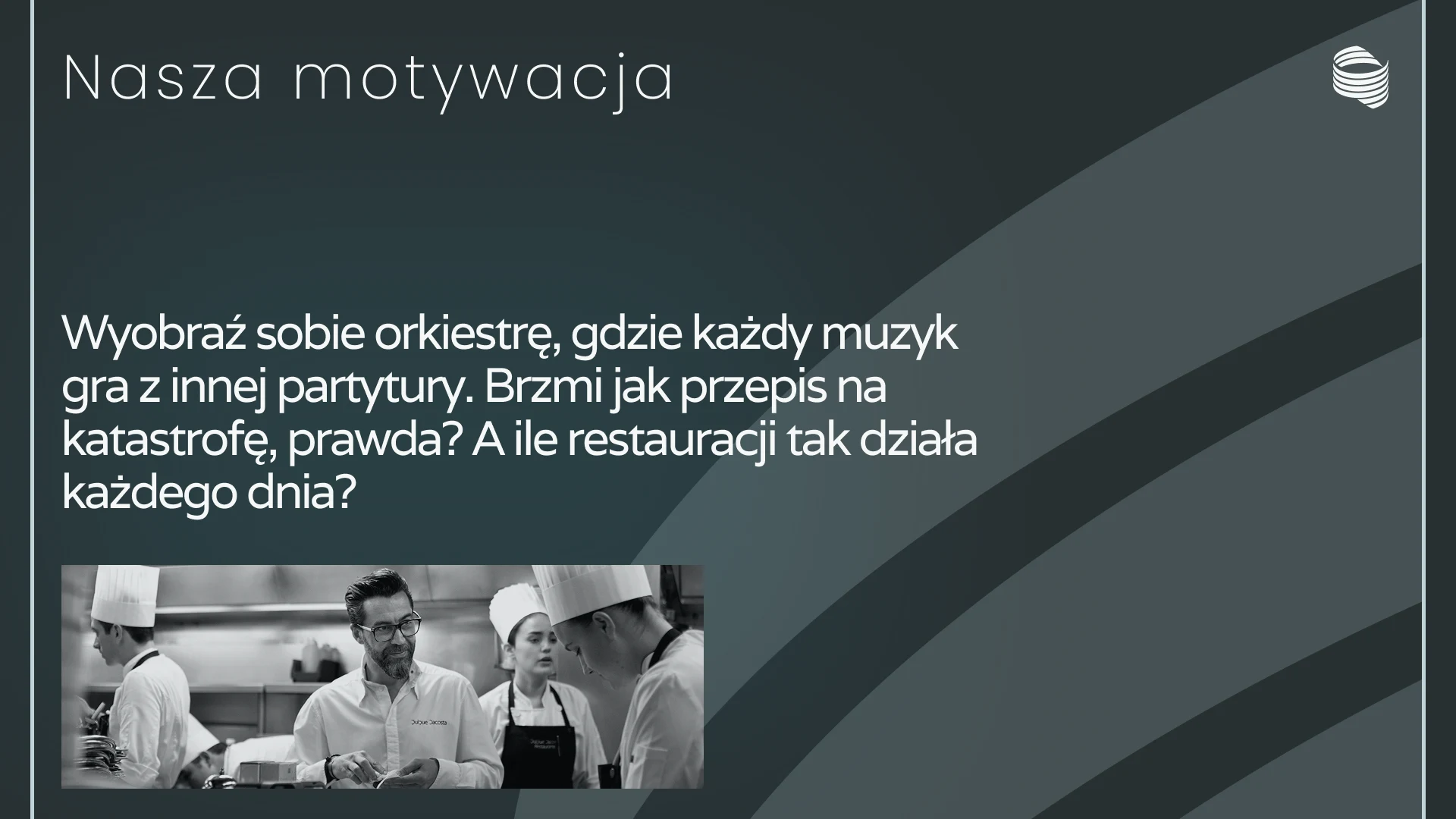
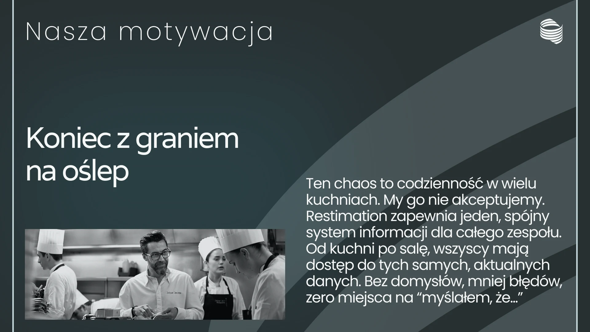
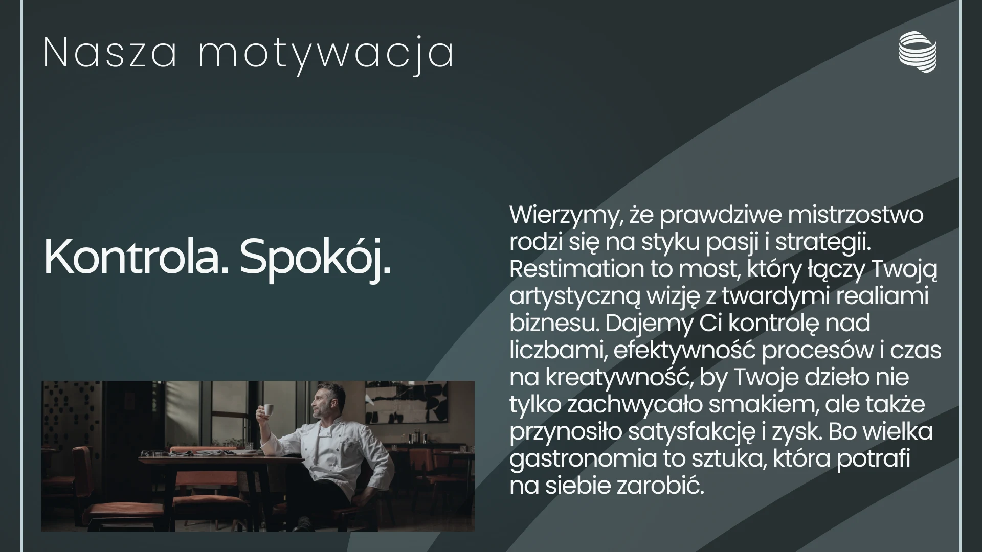
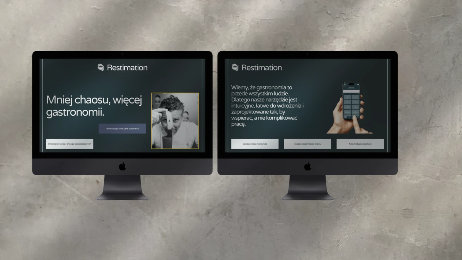
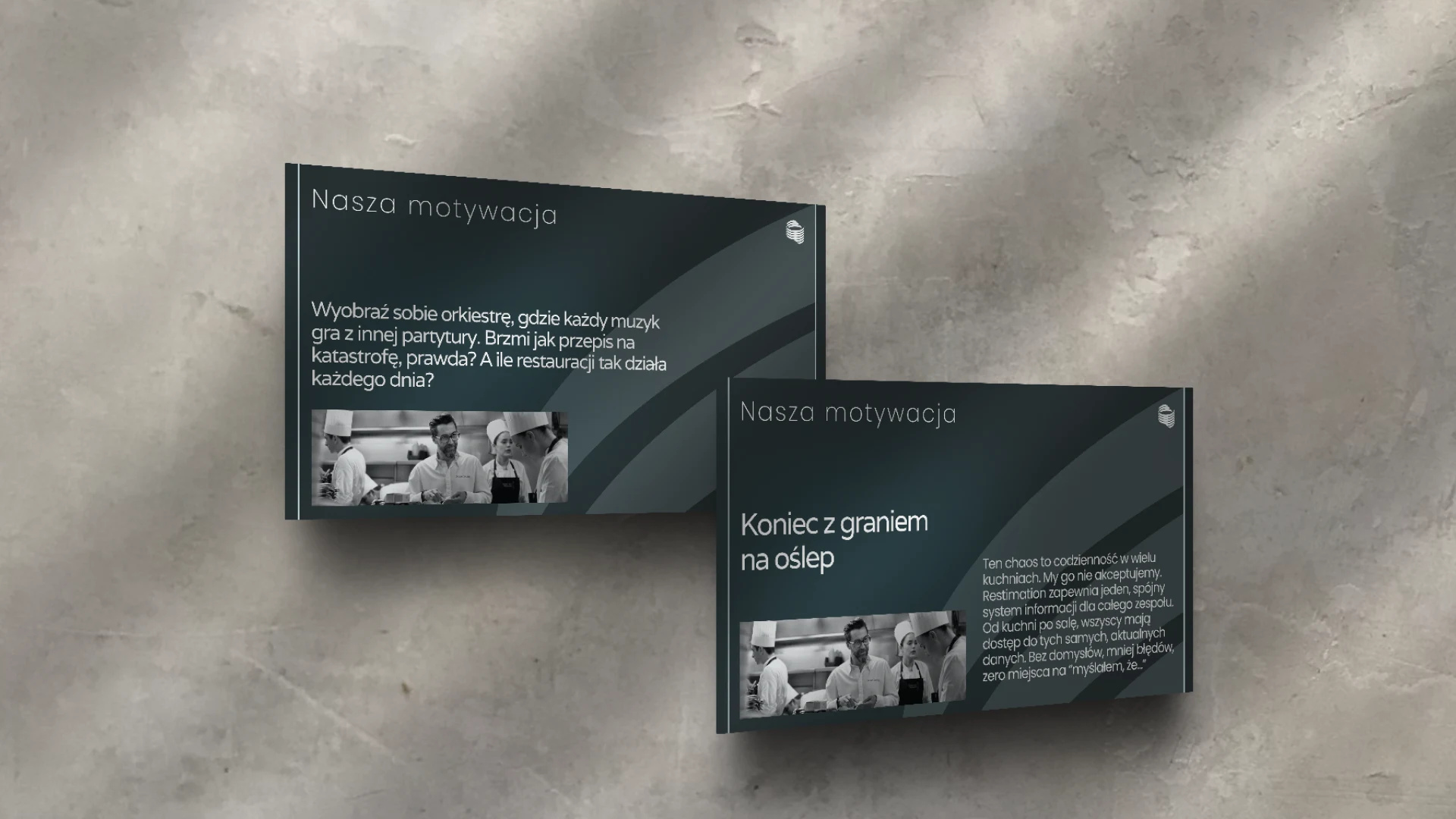
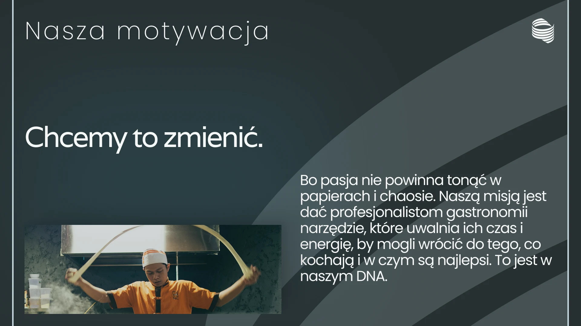
- An 8-slide „Nasza motywacja” manifesto — from the problem (that 20% of time, the orchestra metaphor) to the promise („Kontrola. Spokój.”).
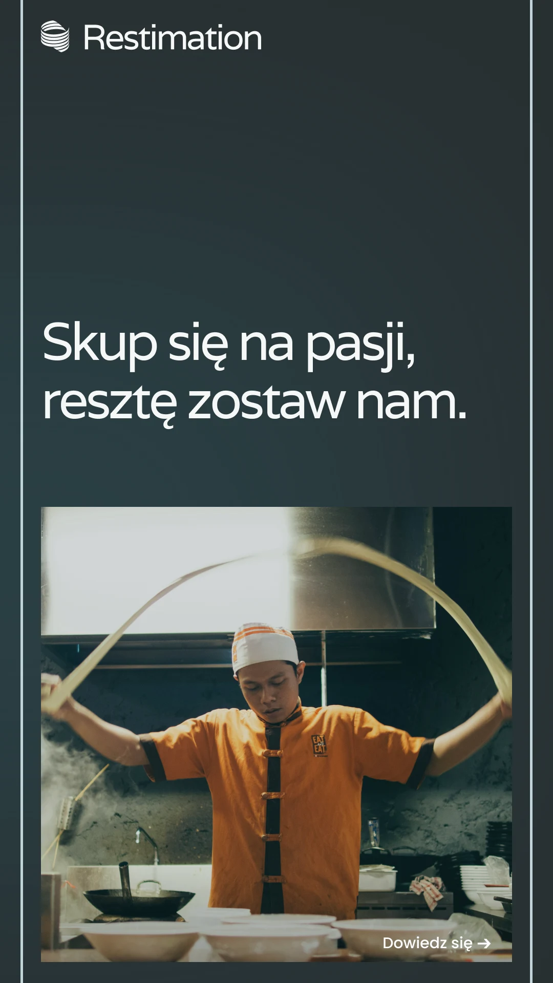
- Key phrases: „Mniej chaosu, więcej gastronomii”, „Koniec z graniem na oślep”, „Skup się na pasji, resztę zostaw nam”.
- The same tone — warm and confident — in the investor deck and in the app copy.
Mobile app UI
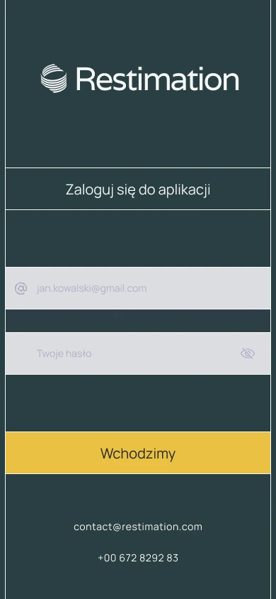
- Login with a „Wchodzimy” button instead of „Log in”.
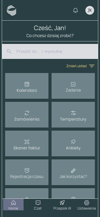
- A dashboard with 8 modules (calendar, tasks, orders, temperatures, invoice scanner, surveys, time tracking, help).
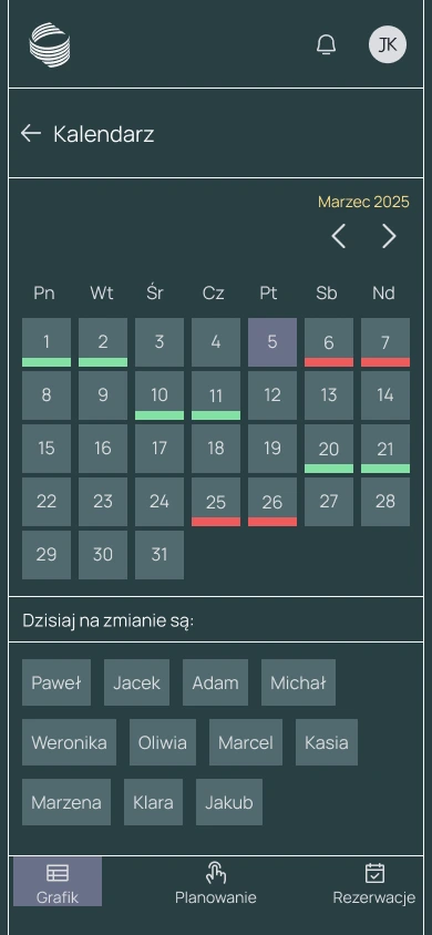
- A kitchen schedule with colored shift status — you can see at once who is in today.
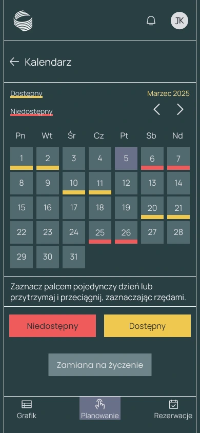
- Employee availability planning with a simple toggle.
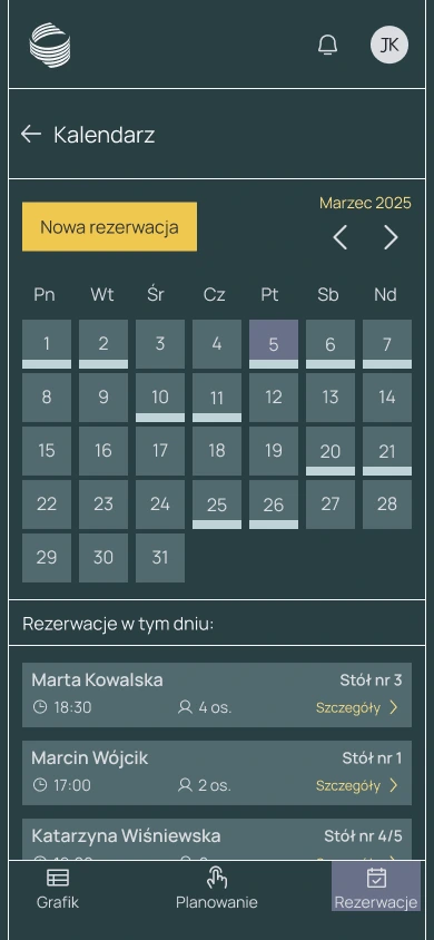
- Table reservations with a day view and a guest list.
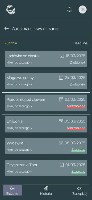
- Tasks with status and due date.
- A navigation slot for „Przepiśnik AI” — a module to be developed (AI in the service of people).
Contact
Tell me about the idea
Describe your idea in one sentence. I will reply within two business days and suggest a first step.